Long before intuitive touchscreens and voice commands, automobile dashboards of the 1970s represented a wild frontier of automotive design. In an era when safety standards were still evolving and digital technology was in its infancy, car manufacturers experimented with dashboard layouts that ranged from minimalist to bewilderingly complex. Engineers and designers, unfettered by user experience research or ergonomic best practices, created instrument panels that often prioritized futuristic aesthetics over actual functionality. The result? A decade of dashboards that sometimes required an engineering degree just to find the headlight switch. Here’s our tribute to twelve head-scratching dashboard designs that made driving in the disco decade an adventure before you even left the driveway.
1. The Horizontal Speedometer Revolution
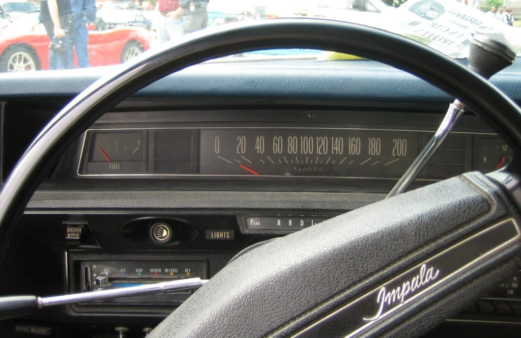
The traditional round speedometer wasn’t good enough for forward-thinking designers of the 1970s, who introduced horizontal ribbon-style speedometers in models like the Chevy Vega, Ford Pinto, and AMC Gremlin. Resembling a ruler with moving lines or a thermometer for speed, these linear gauges theoretically allowed for a wider, more readable scale. In reality, they proved difficult to read at a glance, requiring drivers to refocus their eyes from the road to interpret the unfamiliar format, often leading to dangerous moments of confusion about exactly how fast they were traveling. Curbside Classic doesn’t hold back condemning the inefficient method of displaying some pretty important information in these horizontal speedometer layouts.
What made these horizontal speedometers particularly baffling was their inconsistent design from manufacturer to manufacturer—some moved from left to right, others right to left, while still others featured a moving needle against a fixed background. The illumination was often inadequate as well, with dim bulbs that made nighttime readings an exercise in squinting and guesswork. Perhaps most confusing was the shift from the intuitive “higher means faster” concept of traditional round gauges to a lateral format that had no inherent connection to the concept of speed, creating a cognitive disconnect that drivers simply had to memorize rather than intuitively understand.
2. The Cadillac “Tripmaster” Digital Display
Cadillac’s attempt to usher in the electronic age resulted in the infamous “Tripmaster” digital display, introduced on high-end models in the mid-70s. This early LED display showed basic information like speed and fuel level in glowing red digits that were supposed to represent cutting-edge luxury. Unfortunately, these first-generation digital readouts were nearly impossible to see in daylight, completely washed out in bright sunlight, and blindingly distracting at night. Drivers had to constantly adjust their eyes between the road and these alien numerical displays, creating a safety hazard wrapped in futuristic packaging. Best Selling Cars Blog goes through a timeline of car lights and how far manufacturers have come in perfecting the desin.
The unreliability of these early digital systems added another layer of confusion, with displays that would randomly flicker, display impossible readings (like highway speeds when the car was parked), or simply go dark without warning. Repair costs for these electronic marvels were astronomical, leading many owners to drive with partially functional or completely dead displays rather than pay for replacement. Perhaps most frustratingly, the display’s single color and uniform size for all information eliminated the quick visual hierarchy that traditional analog gauges provided, making it harder to distinguish critical warnings from routine information at a glance.
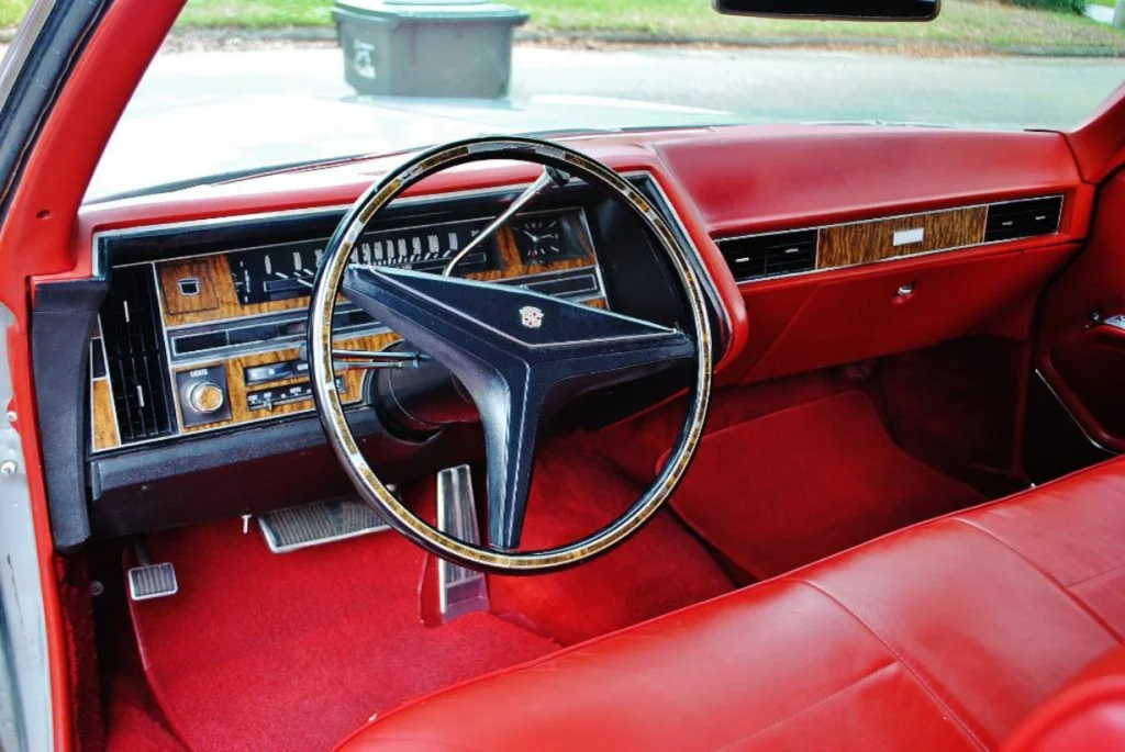
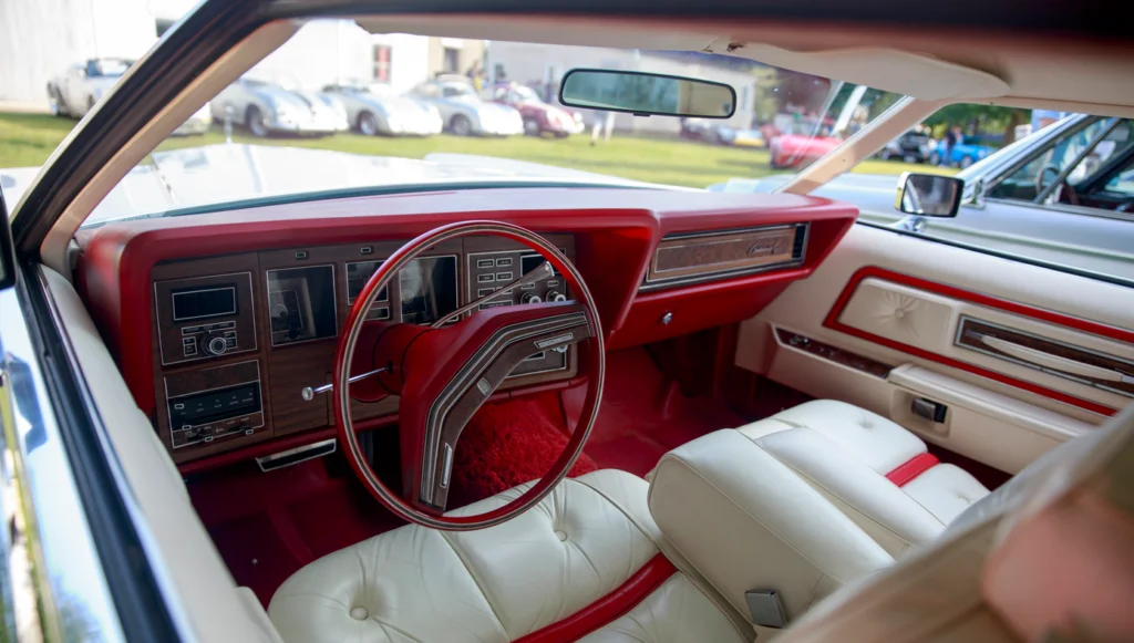
3. The Chrysler “Chronometer” Clock That Ruled the Dashboard
Chrysler’s peculiar prioritization of timekeeping resulted in massive dashboard clocks (branded as “Chronometers”) that were often larger and more prominent than critical gauges like the speedometer or fuel gauge. These oversized timepieces, featured prominently in models like the Cordoba and New Yorker, commanded prime dashboard real estate directly in the driver’s line of sight. While knowing the time is certainly useful, Chrysler’s decision to make the clock the visual centerpiece of the instrument panel reflected a bizarre hierarchy of information that valued style over substance. Collecting Cars reflects on the humble origins of this important mobile timepiece.
The irony of these prominent chronometers was that they were notoriously inaccurate, regularly gaining or losing significant time despite their grandiose positioning and branding. Their large size often pushed more essential gauges to the periphery of the instrument panel where they were harder to read quickly. Even more confusingly, these clocks frequently featured elaborate decorative bezels that matched the exterior’s opera windows and vinyl roof treatments, creating a cohesive styling statement at the expense of clarity and function—a perfect metaphor for automotive priorities in the decade of personal luxury cars.
4. The “Lights Might Be On” Warning System

Before automatic headlights became standard, 1970s cars featured remarkably inconsistent and confusing headlight indicator systems. Some vehicles used green indicators to show headlights were on, others used blue (more commonly used for high beams today), while still others used red lights traditionally associated with warnings. This complete lack of standardization meant that drivers switching between vehicles—or even between different models from the same manufacturer—had to relearn what each colored indicator meant, often resulting in either driving in darkness or wasting battery power with lights left on unnecessarily.
Adding to the confusion was the placement of these indicators, which might appear anywhere from the dashboard to the light switch itself, sometimes hidden by the steering wheel or located in a cluster of similar-looking lights with different functions. Some cars featured automatic reminder chimes for lights left on, but these systems were inconsistently implemented and often malfunctioned, sometimes chiming when lights were actually off or remaining silent when they were inadvertently left on. The confusion around this seemingly simple function highlighted the industry’s early struggles with human-machine interface design, a discipline that barely existed in automotive contexts at the time.
5. The “Idiot Light” Revolution
The 1970s saw manufacturers replace detailed information-rich gauges with simplified warning lights colloquially known as “idiot lights.” These binary indicators offered no gradual warnings or detailed information—they simply remained dark until a problem reached critical status, then illuminated with vague messages like “ENGINE” or “TEMP.” This cost-cutting measure removed the driver’s ability to monitor systems like oil pressure, engine temperature, or battery charge, instead providing information only when problems had potentially already caused damage.
The frustration these simplistic warning systems caused was compounded by their unreliability—they often failed to illuminate when problems existed or would light up unnecessarily due to sensor malfunctions, creating a “boy who cried wolf” situation that led many drivers to ignore them altogether. Their generic labeling meant that when one did illuminate, the driver had little information about the severity or specific nature of the problem, leading to either needless panic or dangerous complacency. Perhaps most confusingly, different manufacturers used different symbols, colors, and abbreviations for the same functions, creating a bewildering lack of standardization across the industry.
6. Ford’s “Safety Sequence” Light System

Ford’s attempt at innovation produced the “Safety Sequence” system, where turn signals transitioned from green to amber to red as you applied increasing pressure to the brake pedal. This multi-color approach theoretically provided following drivers with more nuanced information about your intentions and actions. In practice, it created confusion for everyone—the driver never knew which color was currently displayed, while other motorists, accustomed to standard brake light colors, didn’t understand what the changing colors signified and sometimes misinterpreted the signals entirely.
The system’s reliability issues added another layer of bewilderment, with lights frequently burning out or getting stuck in one color mode. Mechanics often struggled to repair the complex system, sometimes disconnecting it entirely and reverting to standard lighting functions. The dashboard indicator for this system was equally puzzling, with multiple symbols that weren’t intuitive and provided little useful feedback to the driver. This well-intentioned but poorly executed feature demonstrated how innovation without adequate user testing or industry standardization could create more problems than it solved—a recurring theme in 1970s automotive design.
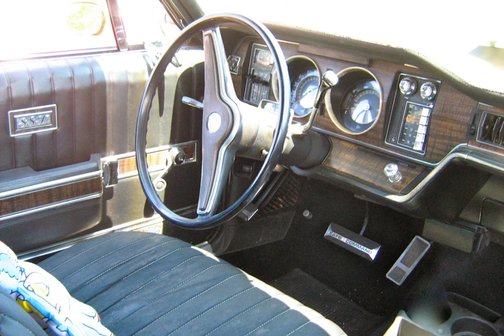
7. The Mustang II’s “Functional” Gauge Package
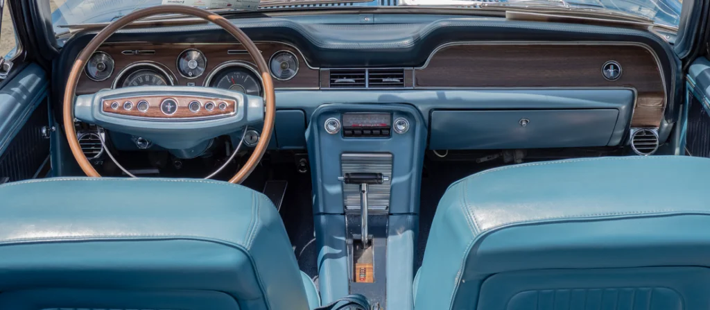
Ford’s Mustang II offered an optional “functional gauge package” that added a tachometer, ammeter, and temperature gauge to the standard setup—except these additional gauges were positioned so low in the center console that they required the driver to completely look away from the road to read them. This positioning made the gauges essentially useless for real-time driving information, creating the illusion of sportiness without the actual functionality. The package seemed designed more for the passenger’s entertainment than the driver’s information needs.
The visual design of these gauges compounded their usability problems, with small markings, similar-looking needles, and inadequate nighttime illumination that made quick readings nearly impossible. The ammeter was particularly confusing, using a center-zero design that required understanding whether a positive or negative reading was appropriate for different driving conditions—knowledge most average drivers didn’t possess. This gauge package exemplified the disconnect between marketing-driven “sporty” features and actual driving utility, prioritizing the appearance of technical sophistication over genuine usability.
8. The GM “Backlighting Roulette”
General Motors vehicles of the ’70s were notorious for their inconsistent instrument illumination, with different gauges and controls often lit in varying colors within the same dashboard. A Chevrolet might have green speedometer lighting, amber for warning indicators, blue for the climate controls, and yet another color for the radio—creating a discotheque effect that was distracting and made quick information gathering difficult. This rainbow approach to illumination wasn’t an aesthetic choice but resulted from different departments designing different components without coordination.
The illumination problems were compounded by wildly inconsistent brightness levels, with some elements glaringly bright while others remained barely visible, with no way to adjust them independently. Replacement bulbs for these multi-colored systems were specific to each position, making maintenance a complicated process of matching bulb types to their correct locations. Perhaps most frustrating was that these color variations conveyed no useful information—unlike modern systems where color coding serves a functional purpose, GM’s rainbow dashboards were simply the result of organizational silos and design fragmentation.
9. The Dodge “Space Age” Control Placement
Chrysler’s Dodge division embraced asymmetrical futurism with dashboard designs that placed essential controls in bizarre locations seemingly determined more by available space than human factors. Models like the Dodge Monaco and Charger featured radio controls that wrapped around corners, climate controls hidden below the dashboard edge, and warning lights scattered across the panel with no apparent organizational logic. This haphazard arrangement meant drivers had to take their eyes off the road for extended periods while hunting for basic functions.
The strange control placement was exacerbated by inconsistent control types—some functions used push buttons, others sliders, still others rotary knobs, with no clear pattern to indicate which would be used for what purpose. The tactile experience was equally confusing, with some controls requiring significant force while others were so delicate they would activate with the slightest touch. This lack of standardization meant that even routine adjustments like changing radio stations or fan speed became complex operations requiring conscious thought rather than developing into the muscle memory that allows for safer adjustment while driving.
10. Oldsmobile’s “Curved Dash” Optical Illusion
Oldsmobile’s attempt at visual distinctiveness led to curved instrument panels where gauges were mounted on a swept surface that wrapped around the driver. While aesthetically striking, this design created serious readability problems as the curved mounting surface distorted gauge readings when viewed from different angles. The speedometer might display different speeds depending on the driver’s height and seating position, creating dangerous uncertainty about actual vehicle velocity. This prioritization of styling over accuracy reflected the era’s emphasis on dramatic interior design regardless of functional impact.
The curved surface created additional problems with glare and reflections, with sunlight or overhead lights bouncing off the curved plastic covers at angles that completely obscured the gauges at certain times of day. The wraparound design also made it impossible to position all gauges at an optimal viewing angle, resulting in some being perpetually in shadow or at an oblique angle to the driver’s line of sight. While the curved dashboard certainly achieved its goal of looking different from competitors, it sacrificed the fundamental purpose of an instrument panel—to provide clear, accurate information at a glance.
11. The Lincoln “Timeless” Dashboard
Lincoln’s 1970s Continental models featured dashboard designs apparently intended to evoke timeless luxury, with old-fashioned stylized displays that hid modern functions behind decorative facades. The squared-off speedometer featured elegant numbering but with increment markers so delicate and closely spaced they were essentially unreadable while actually driving. The fuel gauge abandoned traditional empty/full markings in favor of abstract fractional indicators that required mental calculation to interpret. This triumph of style over function perfectly encapsulated the decade’s occasional prioritization of appearance over usability.
The ornate design extended to the climate controls, which abandoned conventional symbols and labels in favor of baroque styling that matched the exterior but provided minimal visual feedback about their function or current setting. The wood-grained panels and metallic accents, while luxurious in appearance, created distracting reflections and glare problems that further compromised readability. Perhaps most tellingly, Lincoln’s owner’s manuals from this period often included multiple pages explaining how to interpret the dashboard displays—an implicit acknowledgment that their designers had prioritized aesthetic considerations over intuitive functionality.
12. The AMC “All-In-One” Control Pod
American Motors Corporation, always operating with tighter budgets than their larger competitors, created some of the decade’s most bewildering control configurations in their attempt to consolidate functions. Models like the Pacer and Matador featured combination control pods that packed multiple unrelated functions into single units mounted on the steering column. These pods might combine windshield wiper controls, turn signals, headlight switches, and even climate control functions into a single complex stalk with multiple rotational positions, push-pull actions, and twist functions—creating a mechanical puzzle that drivers had to solve while in motion.
These multi-function controls were not only conceptually confusing but physically awkward, requiring peculiar combinations of pushing, pulling, and twisting that were difficult to perform accurately, especially on bumpy roads. The layout of these combination controls varied wildly between different AMC models and years, meaning that familiarity with one system provided no advantage when encountering another. The small, cryptic symbols imprinted on these control pods often wore off over time, leaving drivers to rely on memory or trial-and-error to operate basic functions—perhaps the ultimate example of a dashboard design that created more problems than it solved.
The dashboard designs of the 1970s represent a unique moment in automotive history—caught between the mechanical simplicity of earlier decades and the electronic sophistication that would follow. Their quirky layouts, prioritization of style over function, and experimental approaches to information display created vehicles that could be genuinely confusing to operate. Today’s standardized, user-tested interfaces owe much to the lessons learned from these well-intentioned but often baffling designs. While we might look back with amusement at horizontal speedometers and rainbow-colored gauge clusters, they represent an important evolutionary step in how humans and machines communicate—a reminder that good design is often born from recognizing when something isn’t working as well as it should.