Remember those weekends when you’d stroll past the local cinema, mesmerized by the vibrant posters promising adventure, romance, and thrills beyond your wildest imagination? As we flocked to theaters with our hard-earned dollars and sky-high expectations, we sometimes discovered that the most creative part of the production had already been framed and hung in the lobby. From exaggerated taglines to artwork that seemed to belong to entirely different movies, these marketing masterpieces often outshined the actual celluloid experience they were promoting.
1. Zardoz (1974)
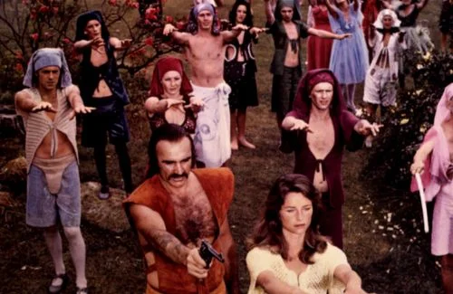
The poster for John Boorman’s sci-fi oddity featured a stern-faced Sean Connery sporting a flamboyant red outfit that looked like a cross between a loincloth and a bandolier, standing before an enormous floating stone head. The tagline promised “Beyond 1984… Beyond 2001… Beyond Love… Beyond Death,” suggesting a profound philosophical journey into a dystopian future that would rival the greatest sci-fi classics of the era. What we got instead was a confusing meditation on immortality featuring Connery in that same ridiculous costume, bizarre dialogue, and a plot that meandered so much that even the most patient viewers struggled to follow along. Rotten Tomatoes shows a lackluster response to the film, further supporting the film’s disappointing delivery.
Many critics now regard Zardoz as a cult classic, but audiences in 1974 were utterly bewildered by the disconnect between the epic poster and the experimental film they witnessed. The floating stone head that dominated the poster did appear in the movie, dramatically spewing guns while pronouncing “The gun is good, the penis is evil,” but this memorable imagery couldn’t save viewers from feeling they’d been sold an entirely different experience. In retrospect, the poster artist deserves an award for making one of the decade’s most perplexing films look like a must-see adventure.
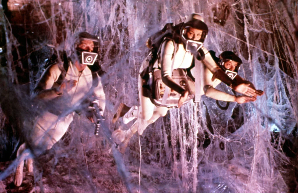
2. The Swarm (1978)
The poster for Irwin Allen’s disaster epic featured a woman’s terrified face covered with killer bees and the ominous warning: “Soon you will be experiencing the most terrifying day of your lives!” Bold yellow and black imagery dominated the design, with additional text promising “The Ultimate Horror Show” and “A CAST OF THOUSANDS OF STARS,” including Michael Caine, Katharine Ross, Richard Widmark, and Henry Fonda. The marketing department spared no expense convincing audiences they were about to witness the most frighteningly realistic natural disaster film of the decade. IMDb reports staggeringly low numbers for this missed opportunity film.
What ticket buyers actually got was a bloated, nearly two-hour slog featuring unconvincing special effects and wooden performances from actors who seemed embarrassed to be there. Despite its all-star cast and massive budget, The Swarm received scathing reviews, with many critics noting the laughable bee attack scenes that looked more like dark specks randomly added to the film stock. Even Michael Caine later admitted it was one of the worst films he ever made, proving that not even an incredible poster could save a movie from becoming a critical and commercial flop.
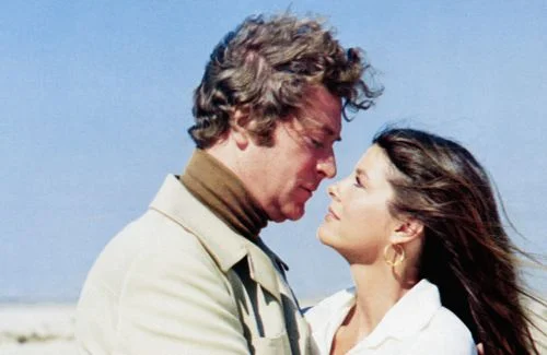
3. Marooned (1969)
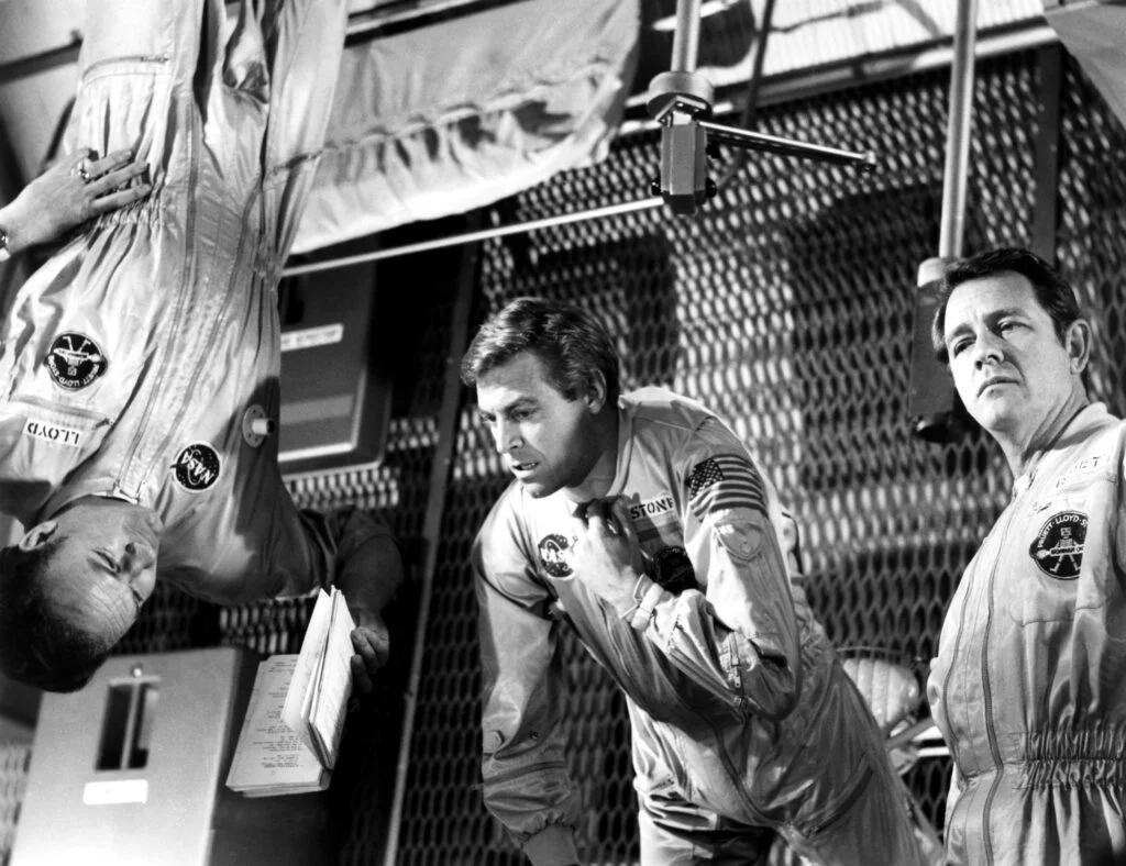
The poster artwork for this space thriller showed astronauts floating helplessly in the darkness of space with Earth looming in the background and the tagline: “Three men trapped in space—their oxygen running out… their spacecraft crippled… while the whole world watches… and waits!” The dramatic imagery and star-studded cast including Gregory Peck, Richard Crenna, and Gene Hackman promised a nail-biting space adventure years before Apollo 13’s real-life drama. Every element of the marketing suggested audiences would be on the edge of their seats throughout this tense cosmic survival story. Rotten Tomatoes has numbers a bit kinder than other ranking outlets, but with a much smaller sample size.
The actual film, however, moved at such a glacial pace that many viewers found themselves struggling to stay awake rather than perched anxiously on their seats. Despite winning an Oscar for Special Visual Effects, Marooned suffered from excessive technical dialogue, long stretches where virtually nothing happened, and a general lack of the suspense so boldly promised in its promotional materials. The film’s deliberate pacing might have aimed for realism in depicting a space emergency, but for audiences expecting the thrills promised by that dynamic poster, the experience was more marooning than the actual astronauts endured.
4. Soylent Green (1973)
The poster for this dystopian thriller portrayed Charlton Heston in a panic-stricken pose with the provocative tagline: “What is the secret of Soylent Green?” Against a sickly green background, additional text warned audiences about a future where “People are still the same; they’ll do anything to get what they need,” suggesting a complex thriller about human nature in a resource-depleted world of 2022. The artwork’s haunting quality and promise of a shocking revelation had sci-fi fans lining up around the block. This film faired a bit better on IMDb than most others, showing the seeds of potential from that poster.
While the film is now considered a classic with one of cinema’s most famous twist endings, many contemporary viewers found the journey to that revelation tedious and disappointing. The budget constraints were painfully obvious, with unconvincing future technology and sparse sets that failed to create the immersive dystopian world hinted at in the poster. Despite Heston’s committed performance and that memorable final line (“Soylent Green is people!”), much of the film consisted of plodding investigation scenes that lacked the intensity and visual imagination of its brilliant marketing materials.
5. Fantastic Voyage (1966)
The poster featured a submarine-like vessel navigating through what appeared to be human arteries, alongside a beautiful woman in a form-fitting diving suit, promising “A journey beyond imagination… into the living body of a man!” The vibrant colors and surreal imagery suggested a psychedelic adventure combining cutting-edge special effects with mind-bending sci-fi concepts. Additional text boasted about the “billion-to-one odds” of this daring mission’s success, setting expectations for a revolutionary cinematic experience.
While the film did pioneer some impressive special effects for its time, winning Oscars for Art Direction and Visual Effects, the actual journey proved far less fantastic than advertised. Long stretches of scientific exposition and dated effects left many viewers checking their watches rather than marveling at the human body’s inner workings. The tedious pacing contrasted sharply with the dynamic action suggested by the poster, and the promised exploration of the body’s “fantastic universe” often looked more like actors swimming through plastic tubes with occasional encounters with oversized props representing blood cells and antibodies.
6. Logan’s Run (1976)
The poster showcased Michael York and Jenny Agutter fleeing through a futuristic cityscape with the tagline “Welcome to the 23rd century: The perfect world of total pleasure,” set against a backdrop of glass domes and sleek architecture. The artwork promised a dazzling vision of the future where “there’s just one catch… you don’t live past 30!” with additional text highlighting “a world where love is forbidden” and “the only thing you can’t have is your 30th birthday.” This compelling concept and the poster’s vibrant imagery suggested a sophisticated sci-fi meditation on youth worship and societal control.
The actual film, though entertaining, featured sets and special effects that frequently resembled a shopping mall decorated with Christmas lights rather than the breathtaking future world depicted in the promotional art. The impressive poster concepts of a domed city and the “Carousel” ritual where 30-year-olds “renewed” (died) were realized with decidedly less impressive miniature work and dated effects that elicited unintended laughter even in 1976. Despite these shortcomings and a rushed final act, the film gained a cult following, though few would argue it lived up to the slick, captivating world promised by its poster campaign.
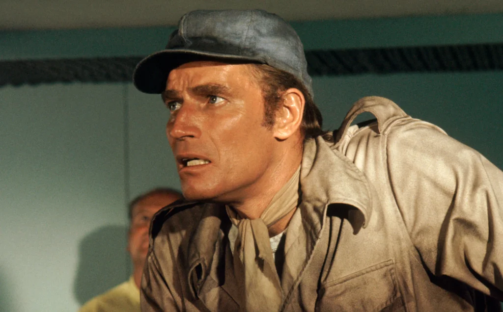
7. The Omega Man (1971)

The poster portrayed Charlton Heston as the last normal human on Earth, standing defiantly with a machine gun against a blood-red background with the bold tagline: “The last man alive… is not alone!” Additional text warned of “creatures who hunt by night” and promised that “the ultimate adventure is about to begin.” The stark, dramatic imagery suggested a relentless action-horror hybrid filled with constant danger and suspense as one man battled against a world of monsters.
What viewers actually experienced was a film that spent considerable time watching Heston’s character driving through empty streets, talking to mannequins, and watching movies alone in his fortress-like apartment. While the film has legitimate merits and has developed a loyal following over the decades, the action sequences were sporadic rather than constant, and the “night creatures” (albino mutants in dark robes and sunglasses) were more campy than terrifying. The philosophical elements about isolation and what constitutes humanity were thoughtful but hardly delivered the non-stop action thriller suggested by that dynamic poster artwork.
8. Barbarella (1968)
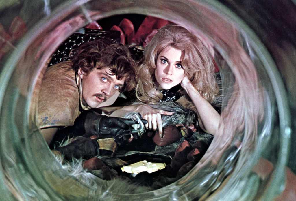
The poster for this sci-fi adventure featured Jane Fonda in various provocative poses wearing futuristic space outfits, with taglines promising “The most beautiful adventuress in the universe!” and “See Barbarella do her thing!” The psychedelic artwork and suggestive imagery marketed the film as a space-age adventure combining action, humor, and the liberated spirit of the swinging sixties. With its vibrant colors and dynamic design, the poster promised a revolutionary sci-fi experience that would redefine the genre.
The actual film, while certainly memorable and now considered a cult classic, was more awkward camp than the sleek adventure suggested by its marketing. The special effects were deliberately cheap-looking, with visible wires moving spaceships and sets that resembled cardboard cutouts, creating a film that felt more like a parody than the groundbreaking space epic hinted at in the poster. Though Fonda committed fully to her role, many viewers found the pacing sluggish and the attempts at humor often fell flat, leading to a viewing experience that couldn’t match the excitement generated by that iconic poster campaign.
9. When Dinosaurs Ruled the Earth (1970)
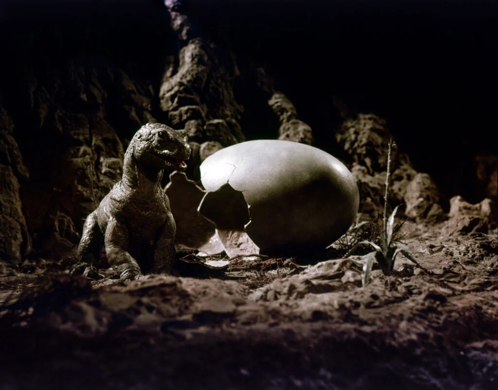
The poster artwork featured a dramatic scene of scantily-clad cave people fleeing from massive, realistic-looking dinosaurs with the tagline: “Travel back through time and space to the edge of man’s beginnings… discover a savage world whose only law was lust!” The dynamic imagery promised groundbreaking special effects rivaling those in “One Million Years B.C.” and suggested an action-packed prehistoric adventure with constant dinosaur encounters and thrilling chase sequences. Hammer Films’ reputation for vivid entertainment further elevated expectations.
What audiences received instead was a film where the dinosaurs—the main attraction promised by the poster—appeared infrequently and moved with the jerky stop-motion animation that even for 1970 seemed technically limited. Much of the runtime was devoted to a convoluted plot involving tribal conflicts and a blonde cavewoman who falls from the sky, communicated through a made-up caveman language without subtitles that left viewers more confused than entertained. Though the film had its moments of genuine creativity, particularly in the dinosaur designs, the experience never matched the non-stop prehistoric action adventure promised by that exceptional poster art.
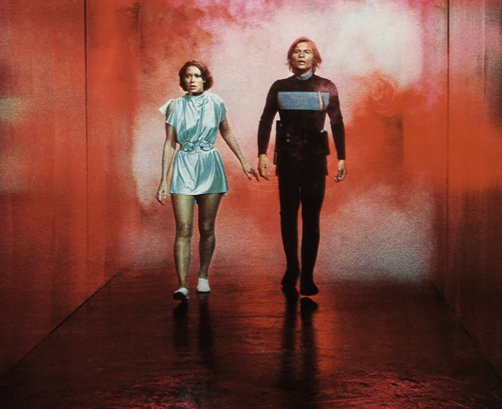
10. Phase IV (1974)
The poster featured a close-up of a human hand with a hole bored through it and an ant emerging from within, accompanied by the chilling tagline: “First, they taught us how to destroy them, now they want to teach us how to kill ourselves!” Additional text warned that “The day the Earth was turned into a cemetery. The ants will inherit the Earth.” This striking imagery suggested a horror film about killer insects taking over the world in apocalyptic fashion, promising intense scares and widespread destruction.
The actual movie, directed by famed title sequence designer Saul Bass, was a slow-burning, philosophical sci-fi film that focused more on the intelligence of ants and mankind’s relationship with nature than on horror or action sequences. Instead of the global ant takeover suggested by the poster, the entire film took place at a single research station in the desert with only three human characters and very few deaths. While the film featured genuinely impressive macro photography of ants that has been praised by critics in subsequent years, audiences expecting the terrifying insect invasion promised by the poster were left wondering when the real action would begin.
The art of movie marketing in the ’60s and ’70s was truly an exercise in creative license, with poster artists and copywriters often creating masterpieces that the films themselves couldn’t possibly match. These disconnects between expectation and reality weren’t necessarily the fault of the filmmakers – sometimes budgets couldn’t stretch to realize ambitious visions, and other times studios simply needed to put rear ends in theater seats regardless of what awaited those viewers once the lights dimmed. Next time you find yourself reminiscing about these cinematic classics, take a moment to admire the marketing wizards who sometimes created the most memorable art of all.