1. Grand Funk Railroad – Shinin’ On
Grand Funk Railroad was no stranger to bold choices, but their 1974 album Shinin’ On took things to a new level. The cover was printed in 3D, complete with a pair of glasses tucked inside the sleeve so fans could enjoy the trippy effect. It made sense in the era of lava lamps and blacklight posters, but it also meant the band’s faces looked a little distorted and downright weird when viewed without the glasses.
The music inside was straightforward hard rock, but the cover gave the impression you were about to go on a psychedelic odyssey. For some listeners, that clash between image and sound was jarring. Fans who didn’t care about gimmicks likely shoved the glasses aside and dropped the needle, while others might have stared at the cover longer than they listened to the songs. It remains one of the strangest marketing tie-ins of the decade.
2. Orleans – Waking and Dreaming

If you’ve ever stumbled across Orleans’ Waking and Dreaming in a record bin, chances are you did a double-take. The cover features the band members posing shirtless, staring soulfully into the camera, with enough body hair to make it unforgettable. It’s intimate in a way that feels almost uncomfortably vulnerable, and yet it was intended as a serious representation of the band.
Musically, Orleans delivered soft rock hits like “Still the One,” which felt completely at odds with the cover’s oddly intense vibe. The clash between laid-back AM radio tunes and the overly earnest photograph left fans scratching their heads. Today, it’s remembered less for its songs and more for how many people recoiled when they saw it. Some covers age gracefully, but this one aged like a shag carpet left out in the rain.
3. Klaus Nomi – Klaus Nomi
Klaus Nomi’s self-titled 1979 debut album looked more like a futuristic art installation than a record cover. The German countertenor stood in a stark, otherworldly outfit that blended elements of a tuxedo with sharp, exaggerated geometric lines. His pale face and theatrical makeup made him look like he had just stepped out of a sci-fi opera.
The music was just as unusual, mixing opera, new wave, and experimental pop into something unlike anything else on the scene. But compared to the strangely formal yet alien cover, the tracks had surprising warmth and humor. It was a package that left listeners unsure whether to laugh, dance, or just stare. Even today, the cover is remembered as one of the boldest artistic statements of the late ’70s.
4. Jefferson Starship – Spitfire
By 1976, Jefferson Starship had embraced full arena rock excess, and their Spitfire cover leaned all the way into fantasy artwork. It featured a dragon wrapped around a spaceship, a scene that looked like it belonged on the side of a van parked at a roller rink. It was colorful and dramatic, but it left people wondering what connection it had to the music.
Inside, the songs were polished rock with a touch of the band’s psychedelic past, not exactly a soundtrack for battling intergalactic dragons. The cover made a promise of adventure that the music never quite delivered. Fans loved the album regardless, but the artwork remains one of the strangest in their catalog. It’s a perfect snapshot of 1970s fantasy overload.
5. Rick James – Come Get It!
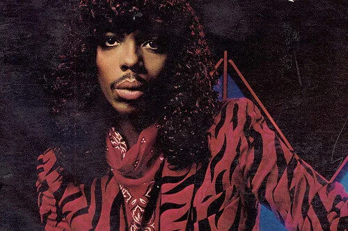
Rick James was always theatrical, but his debut album Come Get It! in 1978 set a bold tone. The cover showed him in a full leather outfit, brandishing a staff while standing on a glowing, cosmic-looking landscape. It looked more like a promo shot for a space-age superhero than a funk record.
The music inside was tight, funky, and sexy—exactly what James would become famous for. But pairing that sound with a cover that screamed “sci-fi warrior” made for a strange first impression. It gave listeners the sense they were about to hear a rock opera about intergalactic love affairs. Instead, they got funky jams that set the stage for his future superstardom.
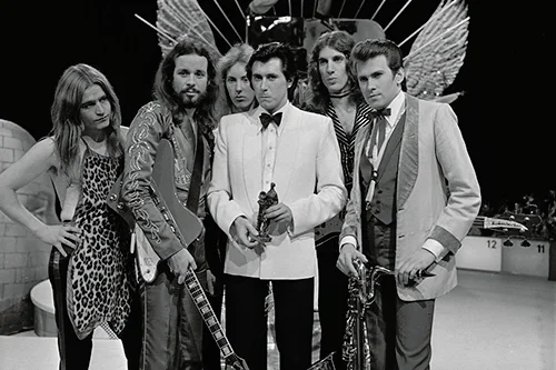
6. Emerson, Lake & Palmer – Love Beach

When you think prog rock, you expect sprawling, surreal artwork to match the complicated music. Instead, Love Beach greeted fans with the band dressed in unbuttoned shirts, gold chains gleaming, and hair blowing in the tropical breeze. It looked more like a Bee Gees knockoff than one of the most intricate rock bands of the era.
The music inside was no less polarizing, with many fans dismissing it as the band’s weakest effort. The awkward photo only made things worse, as it gave the impression of a desperate attempt to chase mainstream trends. It became a cautionary tale of how not to market a prog band. To this day, it’s one of the most mocked album covers of the ’70s.
7. Montrose – Jump on It
Hard rockers Montrose released Jump on It in 1976 with a cover that raised more than a few eyebrows. It featured a woman in a leotard crouching in a way that left little to the imagination. The title combined with the image left no doubt that subtlety was not the goal.
The music, however, was straightforward guitar-driven rock, not nearly as provocative as the artwork suggested. Some fans loved the cheekiness, while others found it in poor taste. Over the years, it’s been remembered less for the songs and more for its place in the “questionable cover art” hall of fame. If shock value was the goal, it certainly worked.
8. Scorpions – Virgin Killer
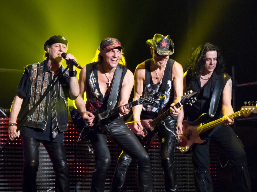
Few album covers caused as much controversy in the ’70s as Scorpions’ Virgin Killer. The original cover featured a highly inappropriate image that was banned in many countries, forcing the band to reissue it with different artwork. Even at the time, many fans questioned what the band and label were thinking.
Musically, the album was solid German hard rock that helped cement the Scorpions’ reputation. But the controversy surrounding the cover overshadowed everything else. It became infamous not for the songs but for the outrage it generated. Today, it’s one of the most talked-about examples of how badly cover art choices can backfire.
9. Black Oak Arkansas – If an Angel Came to See You, Would You Make Her Feel at Home?
With a title that long, you might expect the cover to be equally over the top, and it was. The artwork featured a bizarre mix of rustic imagery and fantasy, with angels and strange backwoods settings colliding. It was hard to tell if it was meant to be serious, ironic, or just plain weird.
The band’s Southern rock sound was gritty and raw, not exactly matching the otherworldly artwork. That disconnect only made the cover stand out more in record shops. While the music had its fans, the cover often overshadowed what was inside. It’s one of those sleeves people remember even if they can’t recall a single track.
10. Gentle Giant – Octopus
Gentle Giant’s prog rock album Octopus came with one of the strangest covers of the decade. The U.S. version featured a giant, cartoonish octopus holding a jar with itself inside, looking simultaneously whimsical and disturbing. It was the kind of imagery that stuck in your mind whether you wanted it to or not.
The music, filled with complex arrangements and shifting time signatures, was already challenging. Pairing it with a surreal cover only heightened the sense that this was not for casual listeners. Fans who got past the odd artwork discovered some of the band’s best work. Still, the cover alone was enough to keep casual browsers guessing what kind of madness awaited them.
11. Roxy Music – Country Life
Roxy Music had a reputation for pushing boundaries, and Country Life was no exception. The cover featured two scantily clad models in lingerie, partially obscured by foliage. It was bold, controversial, and in some places, completely banned.
The album itself was sophisticated art rock, far removed from the overtly sexual cover. Critics praised the music, but casual buyers often picked it up because of the provocative sleeve. The clash between Bryan Ferry’s carefully crafted songs and the risqué imagery made it memorable. It’s still debated whether the art helped or hurt the band’s credibility.
12. Ted Nugent – Tooth Fang & Claw
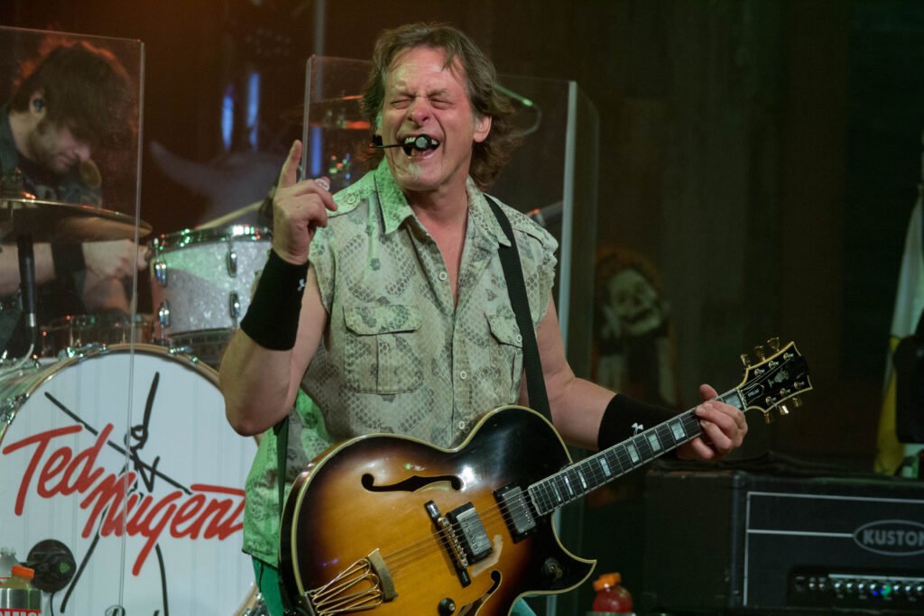
Ted Nugent’s 1974 album Tooth Fang & Claw had a cover that seemed designed to shock. It showed Nugent crouched like a wild animal, surrounded by teeth and claws in a primal setting. The effect was somewhere between terrifying and unintentionally funny.
The music inside was loud, aggressive rock, but not nearly as savage as the cover implied. It gave the impression you were about to hear a man literally rip apart his guitar with his bare hands. Instead, you got Nugent’s signature mix of riffs and attitude. The imagery, though, was unforgettable in its feral strangeness.
13. Captain Beefheart – Bluejeans & Moonbeams
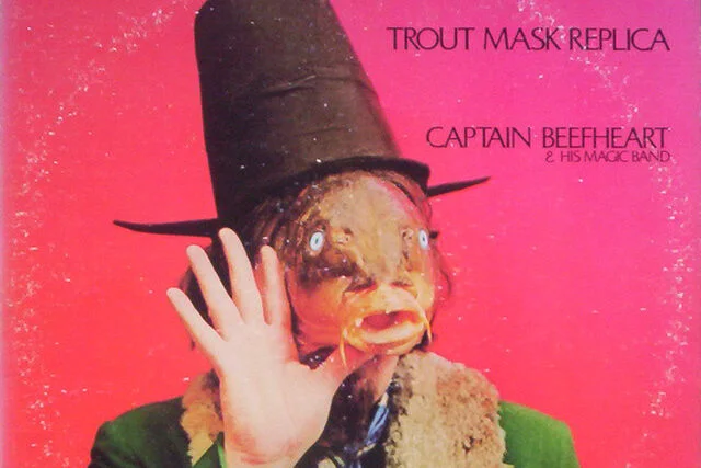
Captain Beefheart was known for experimental sounds, but Bluejeans & Moonbeams came with one of his strangest covers. The art depicted a surreal, almost pastoral image that looked like it belonged on a greeting card rather than a rock album. It was strangely soft and comforting compared to his usual chaotic reputation.
The music inside leaned more toward straightforward rock, making it one of his most accessible albums. That mismatch between the gentle cover and the eccentric artist’s reputation confused fans. It wasn’t the bold, bizarre Beefheart they expected, and the artwork only reinforced that. Today, it remains a curiosity in his catalog.