1. It Started with a Shift Toward Earth Tones in the Late ’60s
By the late 1960s, design trends were moving away from the bright, candy-colored kitchens of the ’50s and toward something that felt more grounded and natural. Avocado green fit perfectly into that shift, offering a softer, more organic look that felt connected to the outdoors. It wasn’t just a random color choice, it reflected a broader cultural interest in nature, especially as environmental awareness began to grow during that era. Homeowners wanted spaces that felt calmer and more modern, and this muted green delivered that in a way pastels no longer did.
Appliance manufacturers quickly picked up on this change and began offering avocado green as a standard color option. It wasn’t limited to one brand either, companies across the industry adopted it almost simultaneously. That widespread adoption helped normalize the color and made it feel like the default choice rather than a bold one. Before long, it became one of the defining looks of a “modern” kitchen heading into the 1970s.
2. Major Brands Fully Committed to the Color
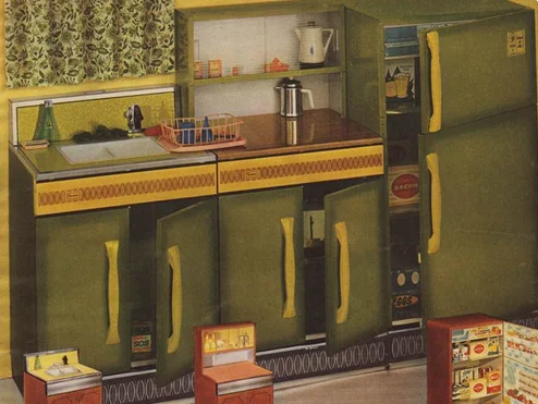
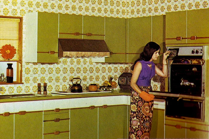
Once avocado green proved popular, major appliance companies leaned in heavily. Brands like General Electric and Whirlpool Corporation began producing entire appliance suites in matching shades. Refrigerators, ovens, dishwashers, and even range hoods were all available in avocado green, making it easy for homeowners to create a fully coordinated kitchen.
This level of commitment helped turn the color into more than just a trend, it became a standard offering. Showrooms often displayed full kitchens in avocado green, reinforcing the idea that this was the look to have. Because these appliances were expensive and built to last, many households ended up living with the color for decades. That longevity is part of why the trend remains so recognizable today.
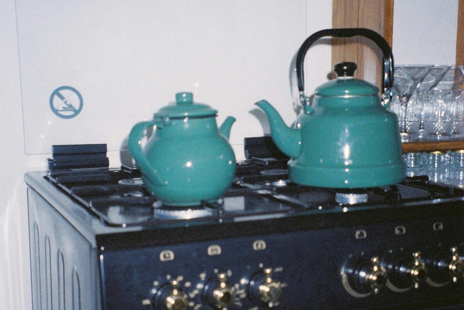
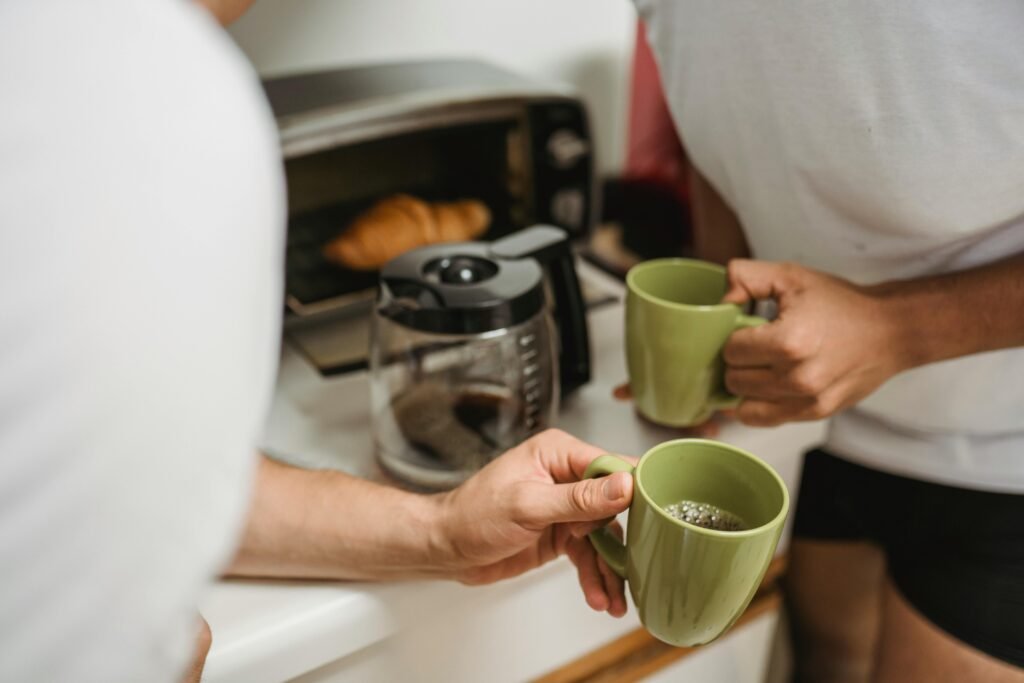
3. It Paired Perfectly with Popular Kitchen Materials
Avocado green didn’t exist in a vacuum, it worked especially well with the materials that were trending at the same time. Wood cabinetry, particularly darker finishes like walnut and oak, became extremely popular in the ’70s. The earthy green tone complemented those woods in a way that felt cohesive rather than contrasting. It also worked well with laminate countertops in browns, tans, and creams.
Together, these elements created a warm, slightly subdued color palette that defined the era. Unlike the stark whites of earlier decades, these kitchens felt layered and textured. Avocado green acted almost like a neutral within that scheme, tying everything together. That compatibility made it an easy choice for homeowners who wanted a coordinated look without hiring a designer.
4. The Rise of Open-Concept Living Increased Its Visibility
As home layouts began to change, kitchens became more visible than ever before. The move toward open or semi-open floor plans meant that appliances were no longer tucked away in isolated rooms. Instead, they were part of the main living space, visible from dining and family rooms. That shift put more pressure on appliances to look stylish, not just functional.
Avocado green helped meet that demand by offering a color that felt intentional and decorative. It allowed appliances to blend into the overall design rather than stand out awkwardly. Homeowners could treat their kitchens as part of the home’s aesthetic instead of a purely utilitarian space. That visibility only accelerated the popularity of coordinated color schemes like avocado green.
5. Advertising Framed It as Modern and Sophisticated
Appliance advertising in the late ’60s and ’70s played a major role in cementing the trend. Companies marketed avocado green as a refined, contemporary choice that signaled good taste. Ads often showed sleek, fully coordinated kitchens with matching appliances, cabinetry, and decor. The messaging suggested that choosing this color meant you were keeping up with the latest in home design.
This kind of branding mattered because appliances were long-term investments. People wanted reassurance that what they were buying wouldn’t feel outdated in a few years. By positioning avocado green as both fashionable and practical, manufacturers made it feel like a safe choice. That perception helped drive widespread adoption across different income levels.
6. It Was Part of a Broader Color Family
Avocado green didn’t stand alone, it was part of a larger palette that included colors like harvest gold, coppertone, and almond. These shades were often offered together, giving homeowners multiple options within the same earthy theme. Among them, avocado green became one of the most popular, likely because it felt slightly more neutral than the others.
Having a range of coordinating colors also meant homeowners could mix and match without clashing. Some kitchens featured avocado appliances with harvest gold accents, while others stayed fully monochromatic. This flexibility made the trend more accessible and appealing. It wasn’t an all-or-nothing commitment, which helped it spread even further.
7. Durability Meant the Trend Stuck Around Longer
Unlike smaller decor items, appliances are not replaced frequently. Refrigerators and ovens purchased in the 1970s often remained in homes well into the ’80s and even ’90s. That durability extended the life of the avocado green trend far beyond its peak popularity. Even as design preferences began to shift, many households continued using these appliances simply because they still worked.
This created a kind of overlap where older styles lingered alongside newer ones. For some, avocado green became associated with being outdated, but for others, it was just part of everyday life. The long lifespan of appliances ensured that the color stayed visible in homes long after it fell out of fashion. That persistence helped cement its place in pop culture memory.
8. Changing Tastes in the ’80s Led to Its Decline
By the early 1980s, design trends began moving in a different direction. Lighter, brighter kitchens started to replace the darker, earth-toned look of the previous decade. White and off-white appliances became more popular, offering a cleaner and more neutral appearance. As a result, avocado green quickly started to feel dated.
Manufacturers responded by phasing out the color in favor of these newer options. Showrooms that once featured avocado green kitchens shifted to showcasing white and stainless finishes. Homeowners renovating their kitchens often replaced green appliances as part of the update. Within a relatively short time, the color went from trendy to something people wanted to remove.
9. It Became a Symbol of the 1970s
Even after it disappeared from stores, avocado green remained strongly associated with the 1970s. It shows up frequently in films, television shows, and retro-themed designs as a quick visual shorthand for the era. Seeing an avocado green refrigerator or stove instantly places a scene in a specific time period. Few design trends are that instantly recognizable.
This association has helped keep the color relevant in a cultural sense. It’s often referenced with a mix of nostalgia and humor, depending on the context. For some people, it brings back memories of childhood kitchens and family routines. For others, it represents a design choice they were glad to see fade.
10. Retro Revival Has Brought It Back in Small Ways
In recent years, there has been a renewed interest in retro design, including elements from the 1970s. While avocado green appliances have not returned to mainstream dominance, the color has made small comebacks in accents and specialty products. Some modern brands offer retro-inspired appliances that nod to the original trend without fully recreating it.
Designers now tend to use avocado green more sparingly, often as a statement rather than a standard. It might appear on a single appliance, backsplash, or piece of decor instead of an entire kitchen suite. This selective use reflects a broader approach to vintage style, where elements are borrowed rather than fully revived. The result is a more controlled, intentional version of a once-ubiquitous look.