1. The Beatles – Yesterday and Today
The “butcher cover” might be the most infamous image of the ’60s. The Beatles, dressed in white lab coats and draped with raw meat and dismembered baby dolls, were trying to make a darkly humorous statement about how their music was being “butchered” for U.S. audiences.
The public didn’t find it funny. The backlash was so intense that Capitol Records recalled and reissued the album with a tame new photo. Today, surviving copies of the original are worth thousands, and it remains one of the most notorious mistakes in album art history.
2. The Rolling Stones – Their Satanic Majesties Request
When you first glance at this psychedelic fever dream, it’s hard to even find the band members. The Stones appear as glittery wizards surrounded by swirling colors and bizarre props, all captured in a 3D lenticular image that changes as you move it.
It was meant as a cheeky response to Sgt. Pepper’s Lonely Hearts Club Band, but critics saw it as indulgent and strange. Still, over time, the cover became iconic for representing the band’s brief, trippy detour before they went back to pure rock swagger.
3. Herb Alpert & The Tijuana Brass – Whipped Cream & Other Delights
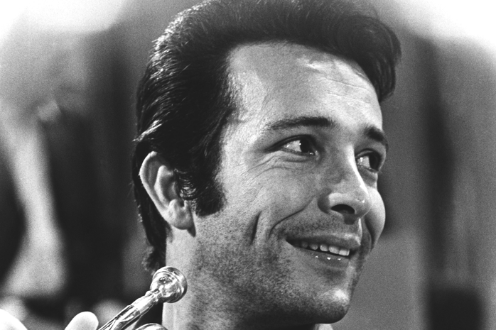
This is one of those covers that practically defined the ’60s bachelor pad aesthetic. Model Dolores Erickson, wearing nothing but shaving cream (and secretly three months pregnant), smirks at the camera as if she knows the scandal she’s causing.
Parents pretended not to notice, teenagers hid it under their beds, and the image became a pop-culture legend. The music itself—smooth, upbeat instrumental tunes—couldn’t be more different from the provocative photo that sold millions of copies.
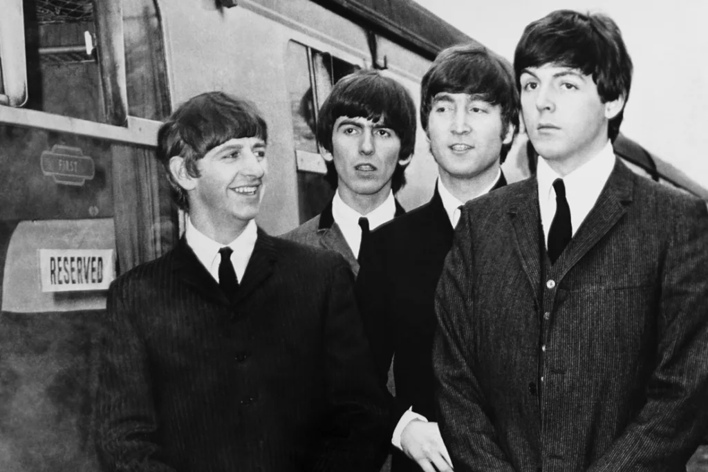
4. The Beach Boys – Pet Sounds
It’s hard to believe one of the most beloved albums of all time has a cover showing the band feeding goats at a petting zoo. It’s charming in a goofy way, but completely mismatched with the sophisticated, emotional sound inside.
Brian Wilson’s masterpiece deserved something grander, but maybe that’s part of its charm. The awkwardly cheerful photo reflects a band trying to hold onto their image while secretly reinventing pop music forever.
5. Bob Dylan – Blonde on Blonde
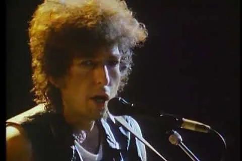
At first glance, the blurry cover photo looks like a mistake. Dylan stares at the camera in a wool scarf, his expression unreadable, while the background fades into soft focus.
The photo wasn’t planned to look that way, but its dreamy imperfection matched the album’s mysterious tone. Fans spent decades debating its meaning, which only added to Dylan’s mythic allure. Sometimes, an accident becomes the best kind of art.
6. Simon & Garfunkel – Bookends
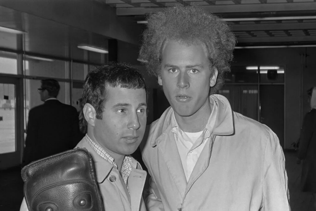
The stark black-and-white close-up of Paul Simon and Art Garfunkel feels oddly somber for a folk-pop duo known for gentle harmonies. Their faces are serious, almost haunting, as if they already knew this would mark the beginning of their end.
The simplicity made it powerful—no flashy graphics, just two friends staring into time. It perfectly reflected the bittersweet nostalgia that filled the album, proving that even minimalism could be deeply strange in an era of swirling psychedelia.
7. The Doors – Strange Days
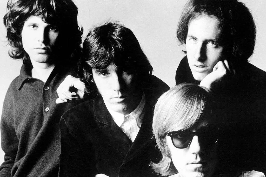
No, that’s not the band on the cover—it’s a cast of circus performers, including a strongman, a midget, and a trumpet player, parading through a New York alley. The result feels like a surreal dream, full of tension and mystery.
The Doors wanted something that captured the odd energy of their music without being literal. It worked. The photo feels eerie and alive, perfectly matching the haunting sounds of “People Are Strange” and “Love Me Two Times.”
8. The Monkees – Head
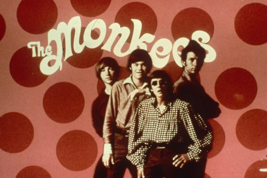
For a group that started as a TV comedy act, their movie Head and its accompanying album took an unexpectedly avant-garde turn. The cover is just reflective silver—no faces, no title, just the word Head faintly embossed.
It forced listeners to literally see themselves in the album. The concept went over most fans’ heads (pun intended), but it’s since become a cult favorite for its bold weirdness. The Monkees were clearly more self-aware than anyone gave them credit for.
9. Jefferson Airplane – Crown of Creation
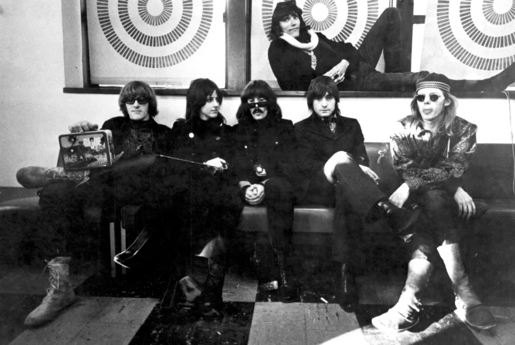
This one looks like it belongs on a sci-fi paperback. The band members’ faces are superimposed over a giant atomic explosion, floating eerily above the blast. It’s both absurd and mesmerizing, a perfect visual for the late-’60s counterculture’s mix of peace and paranoia.
The psychedelic imagery made it stand out, even among the era’s many trippy covers. It’s hard to tell if it’s meant to be serious or tongue-in-cheek, but it’s unforgettable either way.
10. Frank Zappa and the Mothers of Invention – We’re Only in It for the Money
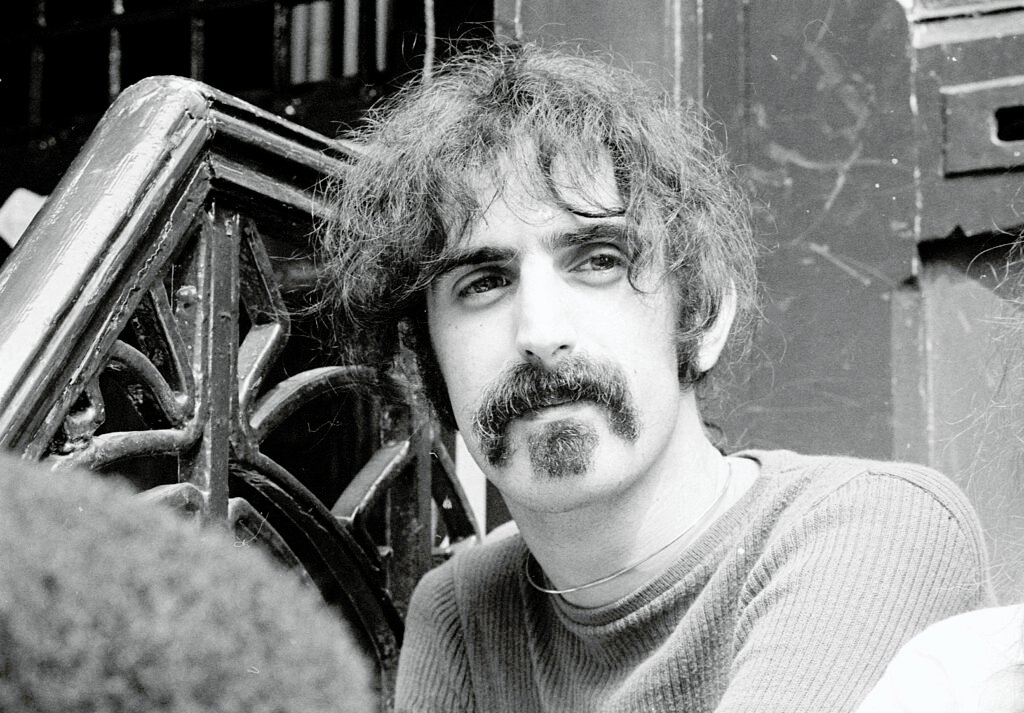
This was Zappa’s parody of the Beatles’ Sgt. Pepper—and it was so on the nose that the record label forced him to change it. The original had the band dressed in outlandish costumes, surrounded by cardboard cutouts mocking pop culture’s self-importance.
The satire was sharp and uncomfortable, but that was the point. Zappa wasn’t interested in pleasing anyone; he wanted to expose the phoniness of the era’s “flower power” image. Few covers have ever been so funny and unsettling at the same time.
11. The Byrds – The Notorious Byrd Brothers
At first glance, this looks like a typical folk-rock cover—until you notice the horse. Standing in the stable window where David Crosby should’ve been after his departure, the horse became an inside joke that fans couldn’t stop talking about.
The band claimed it wasn’t symbolic, but no one believed them. The image perfectly captured the chaotic state of the group at that point—part majestic, part absurd. It’s now remembered as one of rock’s most unintentionally hilarious album covers.
12. The Velvet Underground – White Light/White Heat
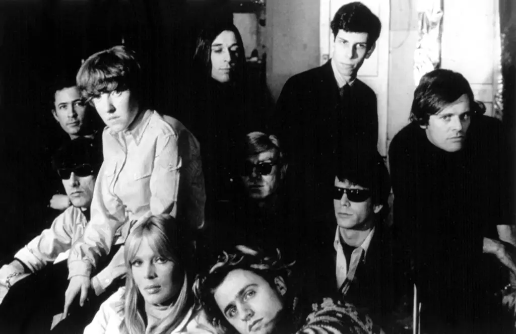
If you’ve ever squinted at this one, you’re not alone. The black-on-black design hides a faint image of a tattoo, barely visible unless you hold it under bright light.
It was Lou Reed’s way of creating something abrasive and secretive, much like the music itself. In a decade full of color and excess, this stark, cryptic design felt rebellious. It still stands as one of the strangest and boldest anti-art statements in rock.
13. The 13th Floor Elevators – The Psychedelic Sounds of the 13th Floor Elevators
Before “psychedelic” was a household word, this Texas band made it their identity—and their cover art made sure you knew it. The swirling red-and-green eyeball practically vibrates off the sleeve, like a hallucination in cardboard form.
It wasn’t subtle, but that was the point. The album captured the early acid-rock explosion before it became cliché, and the design remains one of the genre’s defining visuals. You could spot it across a room—and probably still feel dizzy looking at it.
14. The Who – The Who Sell Out
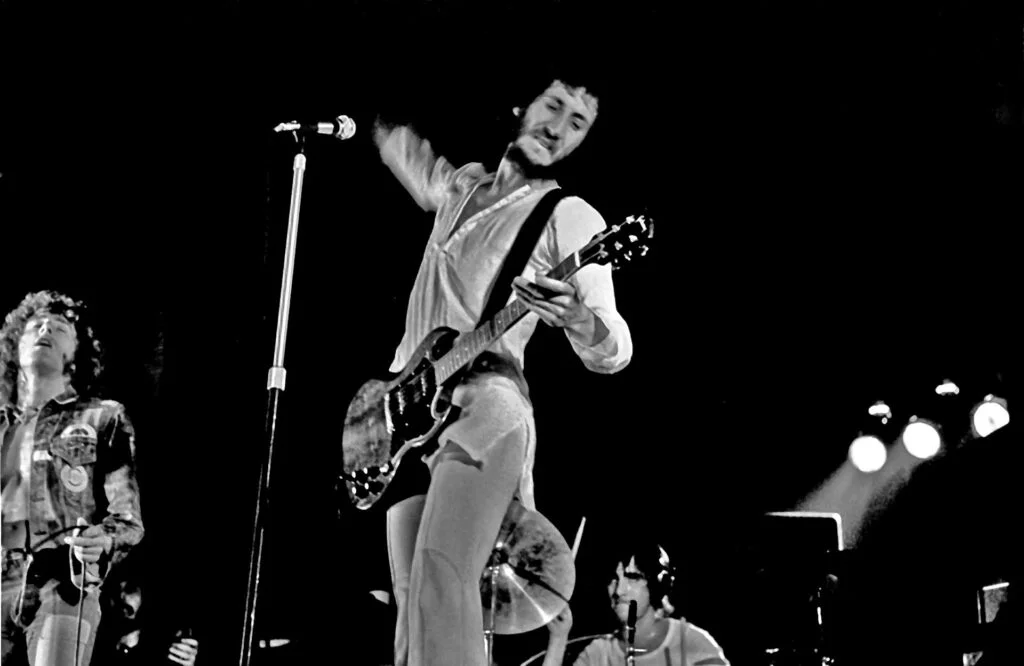
Leave it to The Who to turn their album cover into a full-blown commercial parody. Each band member poses as a ridiculous advertisement—Pete Townshend applying “Odorono” deodorant, Roger Daltrey in a tub of baked beans, and Keith Moon promoting acne cream.
It was a tongue-in-cheek jab at consumerism and radio jingles, but the imagery was so bizarre that some fans didn’t know it was satire. The cover’s over-the-top charm has aged beautifully, proving that even in their weirdest moments, The Who knew exactly what they were doing.