1. Breakfast at Tiffany’s
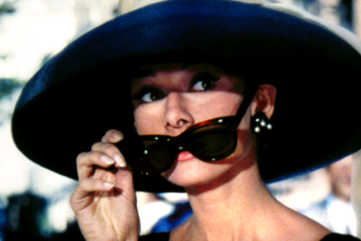
If you grew up loving Audrey Hepburn, chances are this poster flashed through your mind the moment you thought of ’60s cool. The image of Hepburn in her black dress, pearls, and oversized sunglasses became such a cultural shorthand for elegance that people who hadn’t even seen the movie recognized it instantly. What made it special was how effortlessly it blended fashion and film, almost like a magazine cover instead of a movie advertisement. The pops of bright color framing the artwork gave it that perfect mid-century feel.
It also helped establish Hepburn as a true style icon, setting trends that lasted long after the movie left theaters. The poster didn’t shout for attention, it just quietly pulled you in, which is a pretty impressive trick. Over the years, you’ve likely seen it hanging in dorm rooms, apartments, and vintage shops everywhere. It’s one of those posters that feels timeless, even if it was born in the heart of the ’60s.
2. Goldfinger
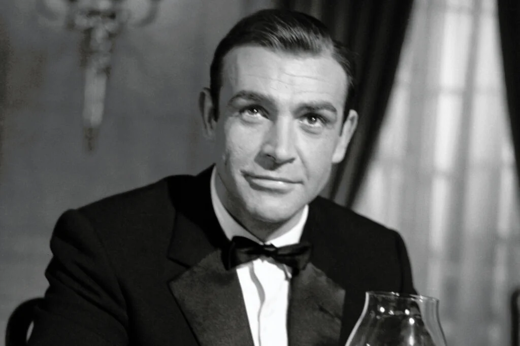
The moment you see this poster, you know you’re looking at a Bond film even without reading the title. The golden woman, shimmering like a piece of art, instantly sets the tone for the high-stakes glamour the franchise was known for. It’s dramatic, mysterious, and a little provocative in a way that fit perfectly with the era’s shifting style. The use of gold as its central theme felt bold at the time, almost like the poster was daring you to look closer.
It also helped cement Sean Connery’s portrayal of Bond as the definitive version for so many fans. The contrast between the gold figure and the cool, confident Bond imagery gave the poster an unforgettable punch. Even now, it’s one of the most collected and reprinted movie posters from the decade. It’s hard not to look at it and think, “Yeah, that’s peak ’60s swagger.”
3. Rosemary’s Baby
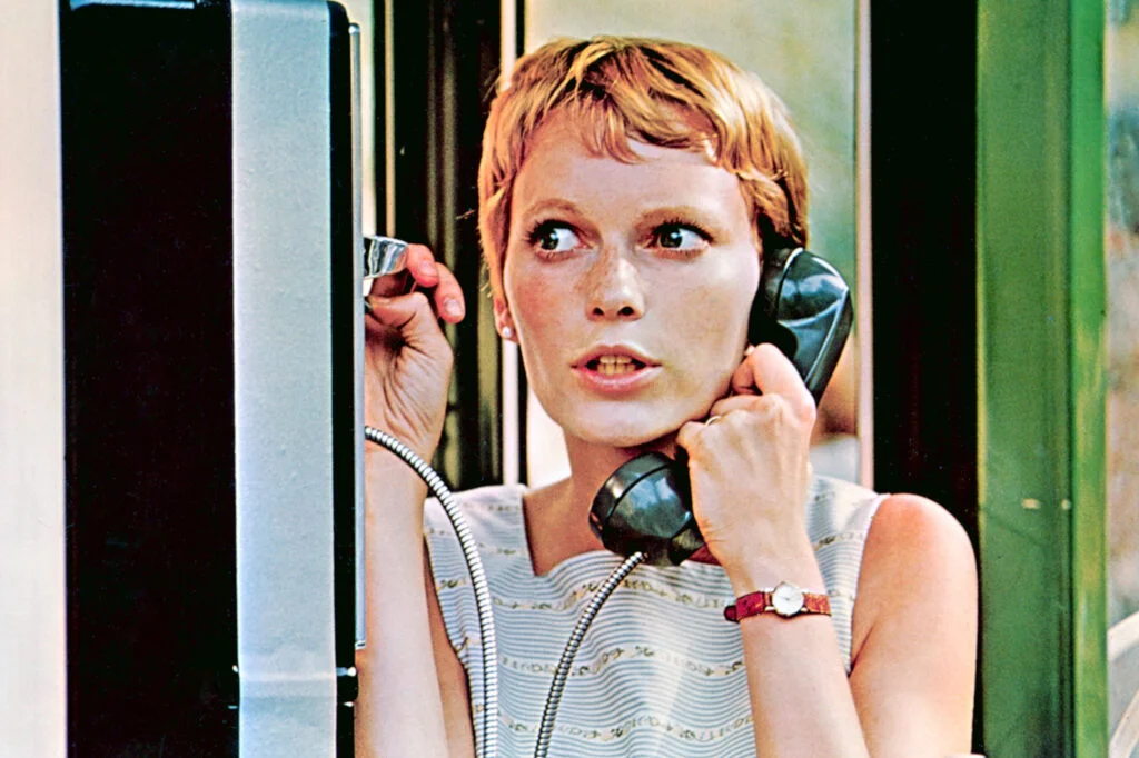
This poster proved that sometimes the simplest image is the most chilling. A shadowy outline of Mia Farrow’s face and the eerie silhouette of a baby carriage on a hill was enough to make people stop in their tracks. The soft green color palette gave it an unsettling calmness, like you were being invited into a nightmare without realizing it. It wasn’t flashy, but that subtlety made it far more disturbing.
The poster became one of the decade’s most influential examples of minimalist horror design. It suggested everything without revealing a single thing, which makes sense for a story built on creeping dread. Even if you hadn’t seen the movie, the poster alone could give you goosebumps. That’s the mark of a truly great piece of visual marketing.
4. The Graduate
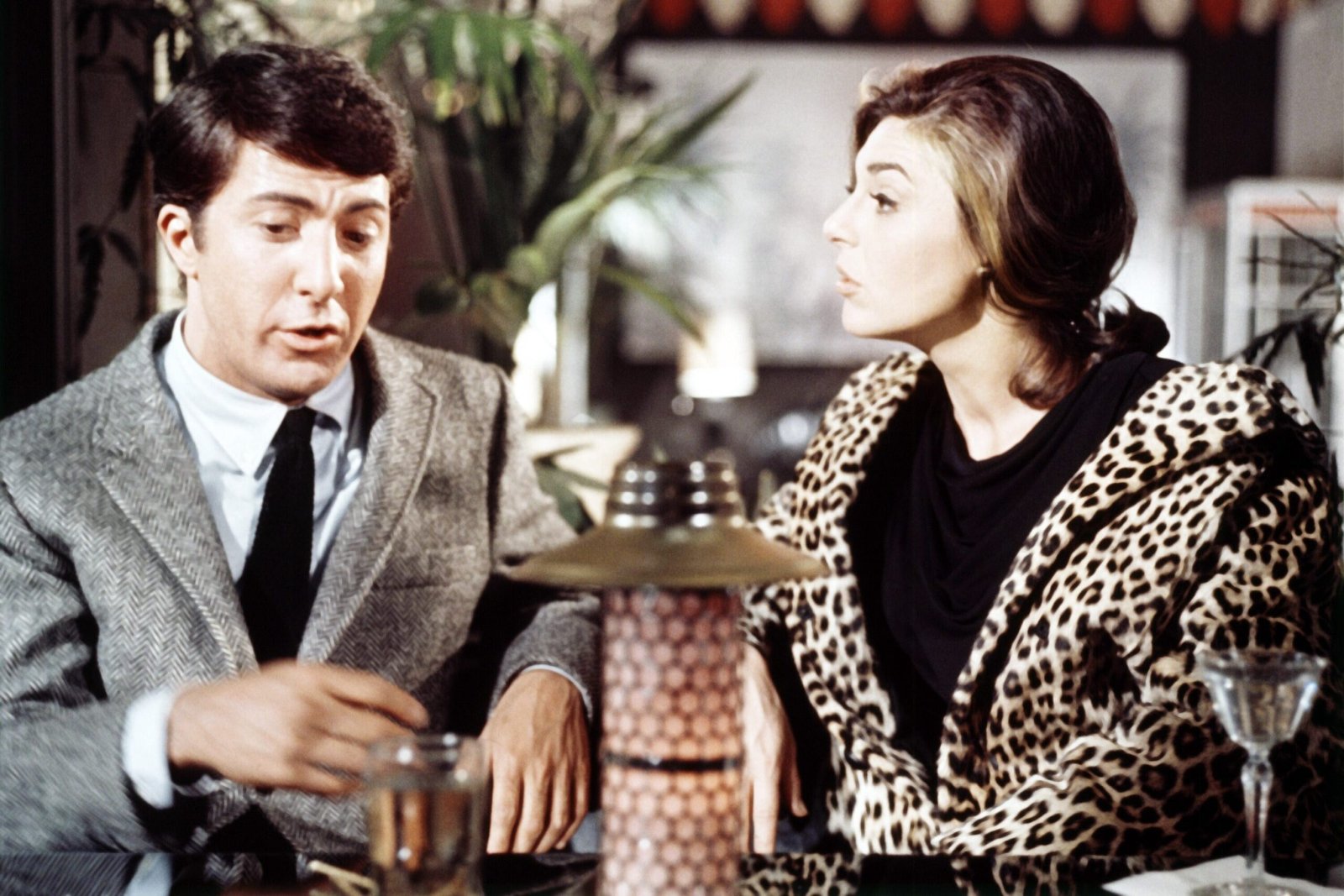
If there was ever a poster that perfectly captured the awkward energy of the late ’60s, it’s Benjamin Braddock standing there while Mrs. Robinson’s leg steals the spotlight. The image instantly told you exactly what kind of movie you were walking into, even before you read a tagline. It felt grown-up, a little scandalous, and completely fresh for its time. The sharp lines and cool tones made it feel modern in a way that set it apart from more traditional posters.
This poster also helped etch Dustin Hoffman’s performance into pop-culture memory. It became one of those instantly recognizable images that people referenced even if they’d never watched the full film. The humor and tension baked into the visual made it special. It’s the kind of poster that feels like a snapshot of an entire era.
5. Barbarella
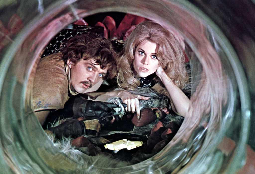
Jane Fonda floating through a cosmic fantasy world was exactly the kind of wild visual the late ’60s embraced. The poster was colorful, chaotic, and filled with futuristic flair that looked like it came straight from a pulp magazine. It was campy in the best way possible, celebrating the quirky charm of sci-fi without taking itself too seriously. Every detail felt exaggerated just enough to make you smile.
What sets this poster apart is how confidently it leaned into its own weirdness. It wasn’t trying to hide the movie’s over-the-top style, it was proudly broadcasting it. That fearless energy helped it become one of the decade’s most beloved cult visuals. Even today, it feels like a perfect snapshot of the era’s playful imagination.
6. Planet of the Apes
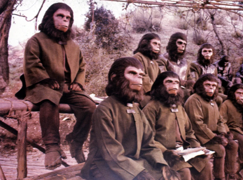
The ’60s sci-fi boom produced a lot of unforgettable imagery, but this poster still stands out. The ruins of the Statue of Liberty half-buried in sand immediately sparked curiosity, even for people who had no idea of the film’s twist. The muted tones gave it an ominous, almost post-apocalyptic feel that set it apart from other sci-fi posters of the time. It practically begged viewers to ask, “What happened here?”
This single image became one of the most iconic reveals in movie history. Even though it spoiled a major plot point, it didn’t diminish the film’s impact, it actually amplified it. The poster helped solidify the movie’s place in the cultural imagination. It’s no wonder fans still consider it one of the greatest sci-fi posters ever made.
7. Easy Rider
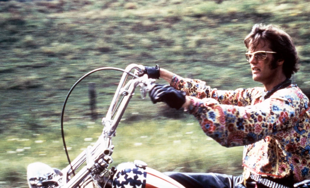
Few posters captured the free-spirited vibe of the ’60s better than the bold, sun-washed image of two bikers riding toward the horizon. The design felt dusty and real, almost like you could hear the rumble of the motorcycles just by looking at it. It tapped directly into the counterculture movement and everything that came with it, from freedom to rebellion. The rough textures added to the movie’s gritty charm.
This poster also helped turn the movie into a symbol of a shifting generation. It felt like an anthem for anyone who wanted to shrug off expectations and chase something different. The simplicity of the design made it instantly readable, which helped it linger in people’s minds. It truly defined road-movie cool.
8. The Sound of Music
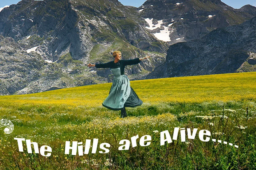
It’s hard not to feel cheerful when you look at Julie Andrews mid-twirl against that picturesque mountain backdrop. The poster radiates the wholesome optimism the movie is famous for, making it almost impossible not to smile when you see it. The bright colors and swooping motion give it a sense of joy that feels completely timeless.
Although it’s much softer than the bold psychedelic posters of the late ’60s, it holds its own by embracing charm instead of edge. It became one of the decade’s most beloved movie images simply because it feels warm and inviting. If you grew up watching the movie on TV every year, you can probably picture this poster instantly. It’s pure classic Hollywood magic.
9. Bullitt
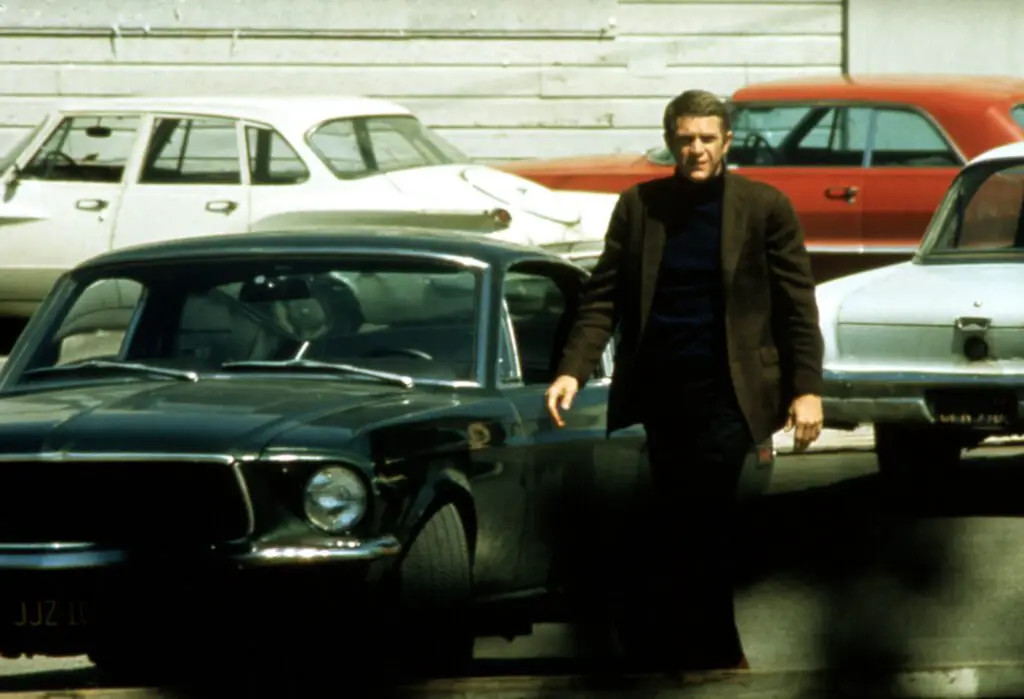
Steve McQueen didn’t have to say a word to look cool, and this poster proves it. The stark black-and-white portrait of McQueen leaning against a wall gave off so much effortless confidence that it practically redefined the word “cool.” The typography added a punchy edge that matched the movie’s raw energy.
The poster became one of those images that helped build McQueen’s legend. Its simplicity helped it stand out at a time when many posters were leaning into busier designs. That stripped-down attitude matched the movie’s iconic car-chase scenes and gritty tone. You didn’t need explosions or bright colors, McQueen alone did all the talking.
10. 2001: A Space Odyssey
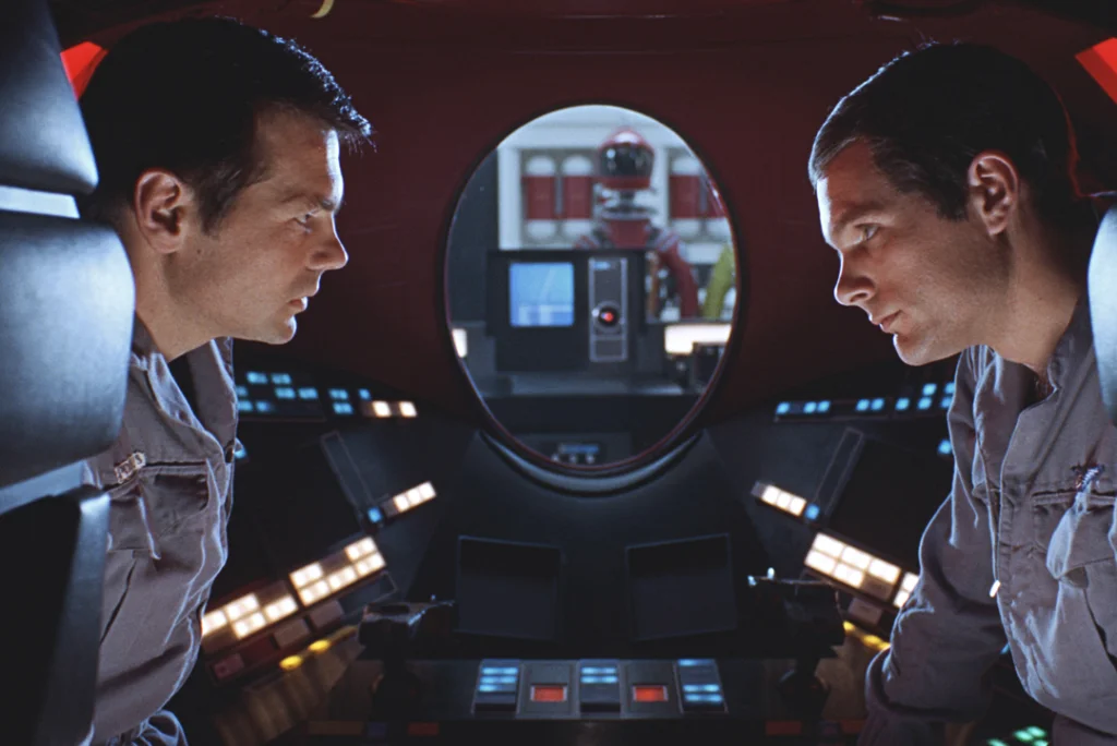
This poster invited viewers to imagine the future in a way no other movie had before. The gleaming space station orbiting Earth looked so sleek and majestic that it felt more like a piece of art than a movie promo. It captured that mix of hope and mystery that defined the era’s view of outer space. The detailed artwork made the future look both beautiful and slightly intimidating.
What makes this poster unforgettable is how forward-thinking it still feels. It didn’t lean into campy sci-fi tropes, it aimed higher, and the artwork reflected that ambition. It helped position the film as something groundbreaking before audiences even stepped into theaters. Even today, it feels impossibly modern for a piece created in 1968.
11. The Pink Panther
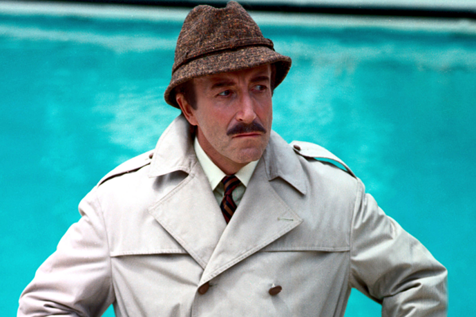
This poster leaned right into its playful charm, using its animated feline star to grab attention. The bright colors and whimsical design matched the film’s mischievous tone perfectly. It felt lighthearted and clever, which helped it stand out among more dramatic posters of the decade.
It also introduced a character who became one of the decade’s most recognizable icons. The poster’s fun, cartoonish vibe resonated with families and adults alike. Over the years, it developed a nostalgic glow thanks to all the animated sequels and commercials that followed. Sometimes, the simplest idea really is the most enduring.
12. Dr. Strangelove
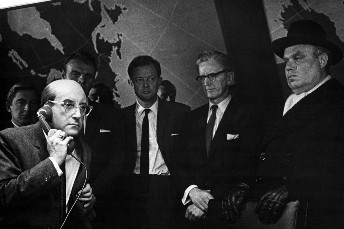
There’s something wonderfully absurd about this poster’s stark, graphic cartoon style. It perfectly matched the movie’s dark humor and biting satire without giving anything away. The bright red and black color scheme gave it a punch that felt unmistakably ’60s.
This poster helped set the tone for audiences who might not have expected such a strange and brilliant film. It embraced the chaos of the story without ever being overwhelming. Its unique style made it instantly recognizable, even decades later. It remains one of the most influential political satire posters of all time.
13. Butch Cassidy and the Sundance Kid
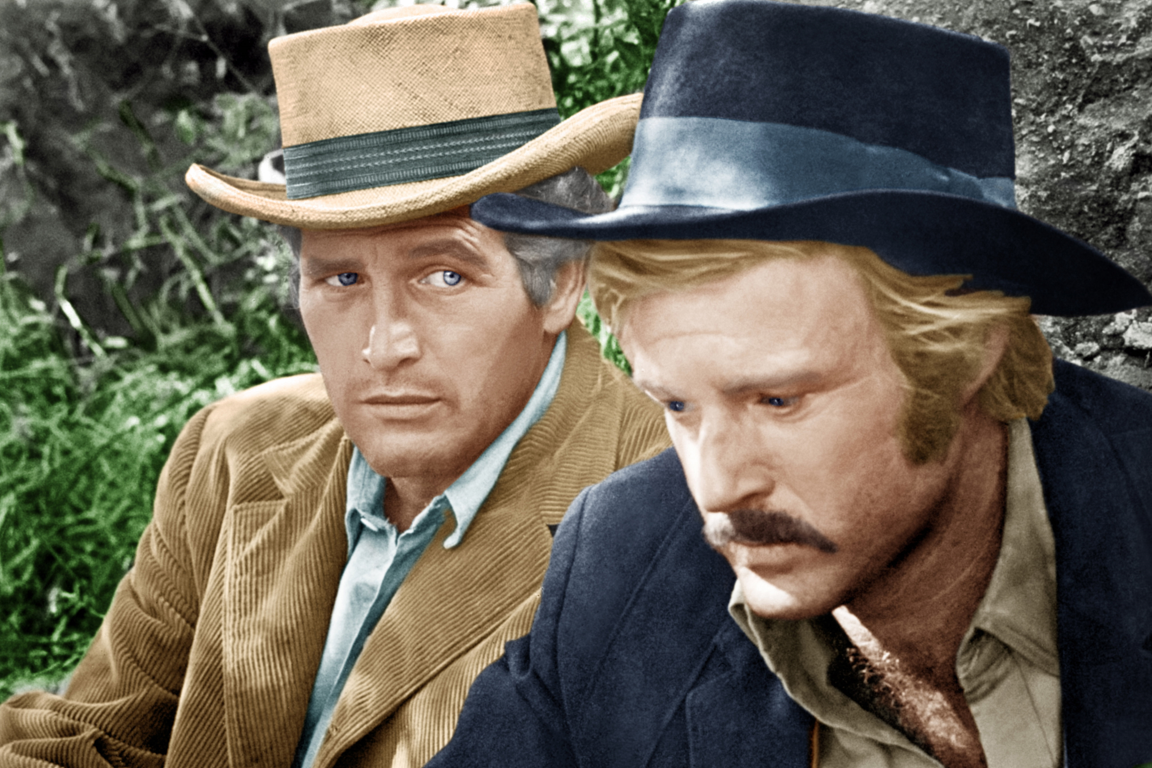
The sepia-toned poster for this Western buddy classic felt like a vintage photograph, which instantly set it apart from typical movie marketing. It gave the film a timeless quality that perfectly captured the rugged charm of Paul Newman and Robert Redford. The simple layout made it feel personal rather than over-designed.
This poster also played up the charisma of its two stars, which was a huge part of the movie’s appeal. It showed just enough action to spark curiosity without overwhelming the viewer. The nostalgic style helped it blend old-school Western vibes with modern cool. It’s one of those posters that feels effortlessly classic.
14. Night of the Living Dead
If you’ve ever seen this poster’s chaotic collage of terrified faces and shadowy figures, you know why it became a horror staple. It perfectly matched the low-budget, high-tension energy of the film. The black-and-white design made everything feel grittier and more immediate, almost like news footage.
The poster captured the sense of panic and dread that made the movie so shocking for its time. Even though the artwork is busy, it never feels messy, just unsettling. It helped redefine what horror could look like, especially for independent filmmakers. It’s no wonder it remains a classic among genre fans.