1. Postwar Optimism Shaped the Look of the Home
In the years following World War II, there was a strong sense of optimism across the United States. Families were moving into new suburban homes, and everything about those homes was meant to feel fresh and modern. Kitchens became a focal point for that shift, especially as more women were encouraged to embrace domestic life in newly built houses. Manufacturers leaned into this mood by offering appliances in cheerful, eye-catching colors. Soft pinks, sunny yellows, and aqua blues reflected a sense of hope and prosperity that people wanted to see in their everyday lives. Neutral tones would have felt too plain for that moment in time. Bright colors helped signal that this was a new era.
It also aligned with broader design trends of the late ’40s and ’50s, which favored bold, coordinated interiors. Pastel appliances were often paired with matching cabinetry, tile, and even countertops. This created a cohesive look that felt intentional rather than accidental. Homeowners weren’t just buying a stove, they were buying into a lifestyle. Color became a way to visually communicate that shift toward comfort and modern living. It made the kitchen feel like a place of pride rather than just a workspace.
2. Advances in Enamel Coating Made Color Possible
Before the mid-20th century, most appliances were finished in basic white enamel or metal. That changed as manufacturers improved enamel coating techniques, which allowed for more durable and vibrant finishes. These coatings could withstand heat, moisture, and regular cleaning without fading quickly. Once companies realized they could reliably produce colorful finishes, they began experimenting with a wide range of hues. It was both a technological and aesthetic breakthrough.
This wasn’t just about looks, it was also about longevity. The enamel finishes were designed to resist chipping and corrosion, making them practical for everyday use. Because of that durability, manufacturers felt confident offering more adventurous colors. Consumers could choose something bold without worrying it would quickly wear out. The result was a surge in colorful appliance options that would not have been feasible a decade earlier. Technology directly influenced style in this case.
3. Companies Used Color to Differentiate Their Brands
As appliance manufacturing became more competitive, companies needed ways to stand out. Color became a key marketing tool, allowing brands to develop signature looks. For example, General Electric promoted its “Mix-or-Match” color program, encouraging consumers to coordinate appliances with their kitchens. Other companies followed suit with their own distinctive palettes. This helped turn appliances into something closer to fashion than purely functional objects.
Advertising played a major role in this shift. Print ads and showroom displays emphasized how color could personalize a kitchen. Instead of settling for standard white, buyers were encouraged to express their taste. This approach made appliances feel more exciting and desirable. It also created a sense of variety in a market that might otherwise have felt uniform. Color became part of the sales pitch, not just an afterthought.
4. Kitchens Became Social Spaces, Not Just Work Areas
Earlier in the century, kitchens were often tucked away and treated as purely functional spaces. By the ’50s and ’60s, that began to change. Open layouts and informal entertaining made the kitchen a more visible part of the home. As a result, people wanted their kitchens to look inviting and stylish. Bright appliances helped achieve that effect.
Color added warmth and personality, making the kitchen feel less like a utility room. It encouraged people to gather there, whether for casual meals or conversation. This shift in how kitchens were used influenced how they were designed. Appliances were no longer meant to blend into the background. Instead, they became part of the room’s visual appeal. That made bold colors more appealing and appropriate.
5. Matching Color Schemes Were a Major Design Trend
Mid-century design placed a strong emphasis on coordination. Homeowners were encouraged to match everything from curtains to countertops. Appliances were a key part of that equation. Manufacturers offered sets in coordinated colors so that stoves, refrigerators, and dishwashers could all align visually. This created a polished, put-together look.
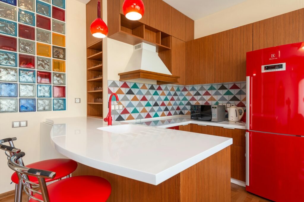
In many cases, entire kitchens were designed around a specific color theme. A turquoise refrigerator might be paired with matching tile and accessories. This level of coordination was seen as modern and sophisticated at the time. It also made decorating feel more intentional. Bright appliances fit naturally into that approach. They weren’t random, they were part of a larger design plan.
6. Consumer Culture Encouraged Personal Expression
The postwar economic boom led to increased consumer spending. People had more disposable income and were encouraged to use it to improve their homes. Appliances were no longer just necessities, they were also status symbols. Choosing a unique color was one way to stand out. It allowed homeowners to express individuality within a fairly standardized suburban landscape.
This idea was reinforced through advertising and media. Magazines often showcased colorful kitchens as aspirational spaces. Owning a brightly colored appliance suggested that you were modern and forward-thinking. It was a subtle way of signaling taste and personality. That made color choices feel more meaningful. It wasn’t just about function anymore.
7. Pastel Colors Were Considered Modern at the Time
Today, pastel appliances can feel dated, but at the time they were seen as cutting-edge. Soft shades like mint green and pale yellow were associated with cleanliness and innovation. They looked different from the heavy, dark tones that had dominated earlier decades. This made them feel fresh and contemporary. Homeowners wanted that sense of newness in their kitchens.
Design trends often reflect broader cultural shifts. In this case, lighter colors suggested a move toward a brighter, more optimistic future. They also complemented other mid-century design elements, such as chrome accents and sleek lines. The overall effect was a kitchen that felt both functional and stylish. Color played a central role in achieving that look. It helped define what “modern” meant at the time.
8. Television and Magazines Influenced Home Design
As television became more common in the ’50s and ’60s, it began shaping how people thought about their homes. Cooking shows and home design segments often featured colorful kitchens. Magazines like Better Homes and Gardens also highlighted these trends. Seeing bright appliances in media made them more desirable. It created a visual standard that people wanted to replicate.
This exposure made color feel like the norm rather than the exception. If every model kitchen in a magazine had pastel appliances, it was easy to assume that was the right choice. Media played a powerful role in reinforcing those ideas. It helped spread trends quickly across the country. As a result, colorful appliances became widely accepted. They were part of a shared cultural image of the ideal home.
9. Manufacturers Offered Limited Color Cycles
Interestingly, the availability of certain colors often followed specific production cycles. Companies would introduce new shades for a few years and then phase them out. This created a sense of novelty and urgency. Consumers felt encouraged to buy while a particular color was available. It also kept the market feeling fresh.
These cycles were similar to trends in fashion. What was popular one year might be replaced by something new the next. This constant change helped sustain interest in colorful appliances. It gave people a reason to update their kitchens periodically. Even if the appliances still worked, the color might feel outdated. That kept the industry moving.
10. Colored Appliances Helped Hide Wear and Tear
While white appliances showed stains and scratches easily, certain colors could be more forgiving. Shades like avocado green or harvest gold, which became popular in the late ’60s and ’70s, were particularly effective at masking everyday wear. This made them practical for busy households. It was a subtle but important advantage.
Manufacturers were aware of this and often promoted durability alongside style. A colored finish could maintain its appearance longer under regular use. That made it appealing to families who used their kitchens heavily. It wasn’t just about aesthetics, it was also about maintenance. Color offered a functional benefit in that sense. It helped appliances look newer for longer.
11. The Rise of Built-In Appliances Changed the Approach
As built-in appliances became more common, their appearance mattered more. Unlike standalone units, built-ins were integrated into the kitchen’s design. This made color choices more visible and more important. A brightly colored oven or dishwasher could become a focal point. It was part of the overall aesthetic rather than a separate object.
This integration encouraged more thoughtful design decisions. Homeowners considered how each element worked together visually. Color played a key role in that process. It allowed for creative combinations and contrasts. Built-in appliances helped elevate the kitchen’s design. Bright colors fit naturally into that evolution.
12. Cultural Trends Favored Bold, Playful Interiors
The mid-20th century saw a broader embrace of bold and playful design. This was reflected not just in kitchens, but in furniture, fabrics, and even cars. Bright colors were part of a larger cultural shift toward experimentation and self-expression. Appliances followed that trend. They became another canvas for color.
This wasn’t limited to pastels either. By the late ’60s and ’70s, deeper and more saturated tones became popular. Colors like orange and green reflected changing tastes. They aligned with the era’s more relaxed and expressive aesthetic. Kitchens evolved along with these trends. Color remained a central feature throughout.
13. Appliances Were Marketed as Long-Term Investments
Appliances were often sold as durable, long-lasting purchases. Because of that, choosing a color felt like an important decision. People expected to live with that choice for many years. This made the selection process more thoughtful. Bright colors were appealing because they felt distinctive and memorable.
Marketing reinforced this idea by emphasizing quality and longevity. A colorful appliance wasn’t just trendy, it was also built to last. This combination made it easier for consumers to justify bold choices. They weren’t seen as risky, but as worthwhile investments. Color added perceived value to the purchase. It made the appliance feel special.
14. The Shift Back to Neutral Came Later
By the late ’70s and into the ’80s, design preferences began to change. Neutral colors like white, black, and stainless steel became more popular. This reflected a shift toward more minimalist and flexible interiors. Bright appliances started to feel dated. As a result, manufacturers reduced their color offerings.
However, the earlier era of colorful appliances left a lasting impression. It remains a defining feature of mid-century kitchens. Today, those colors are often associated with nostalgia and retro design. Some modern brands have even reintroduced them in limited lines. This shows how influential that period was. The trend may have faded, but it never fully disappeared.